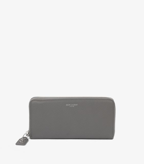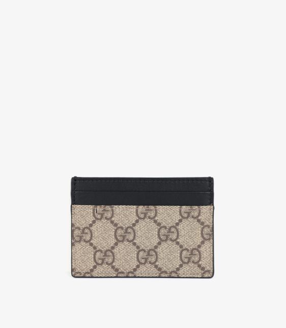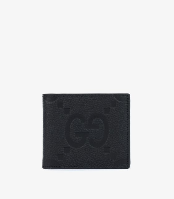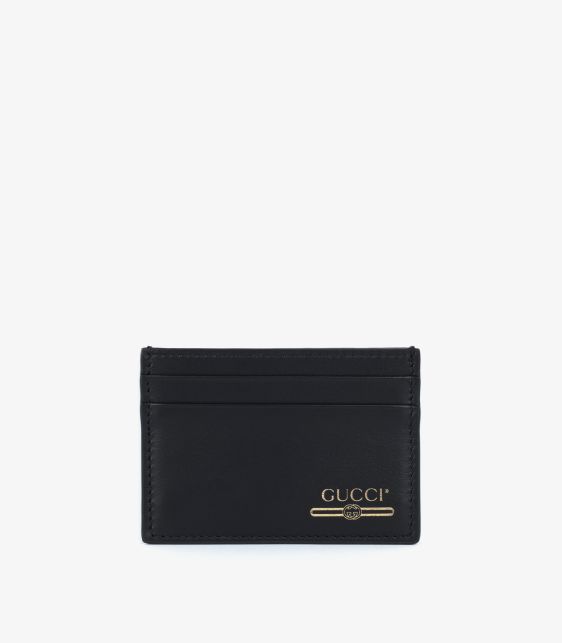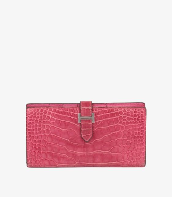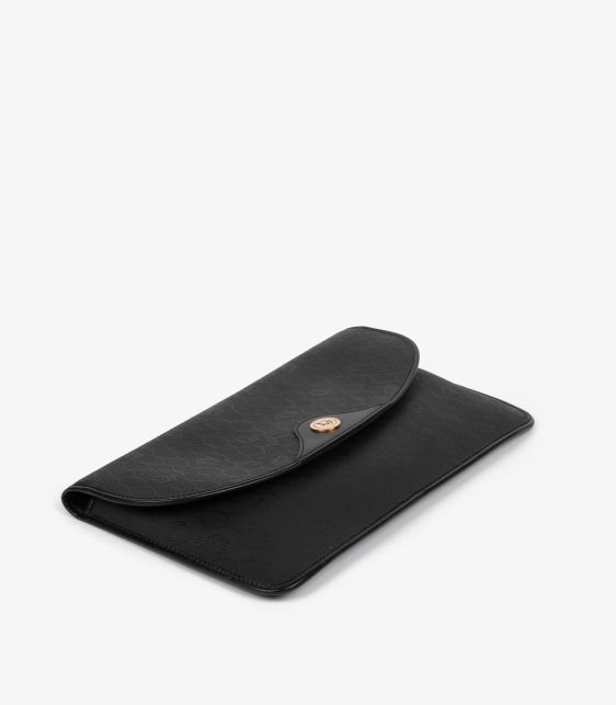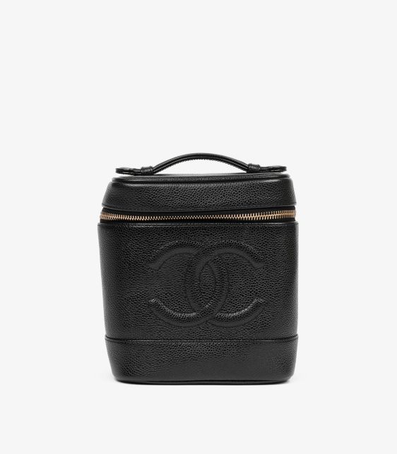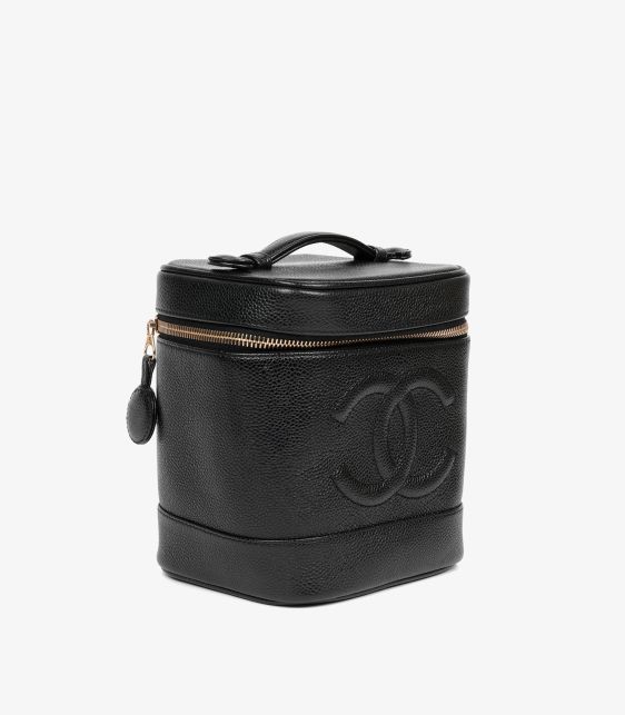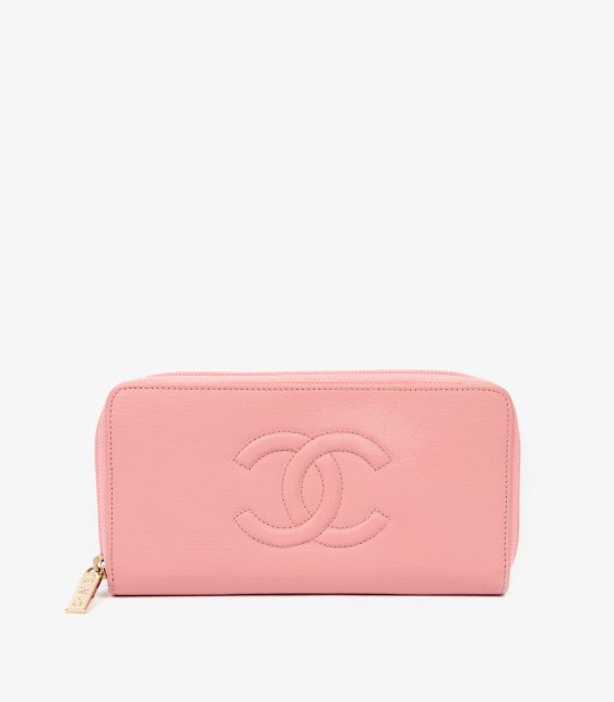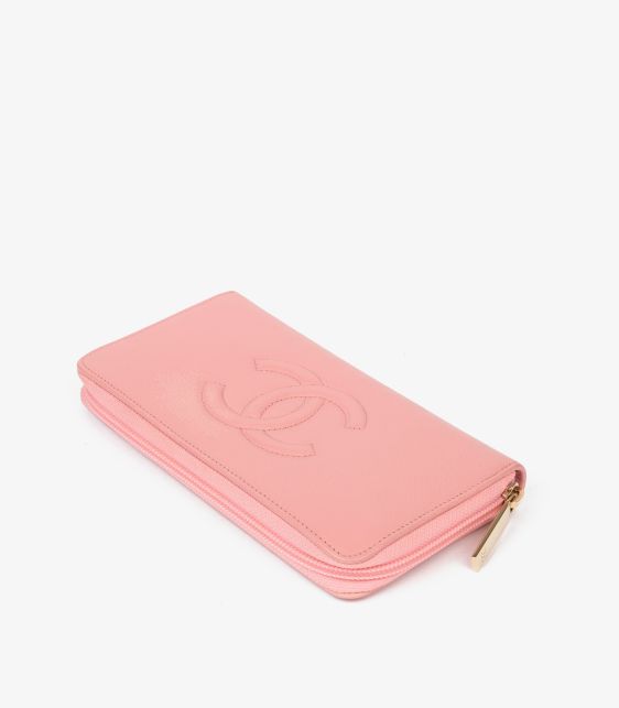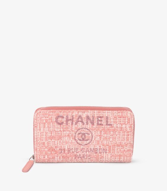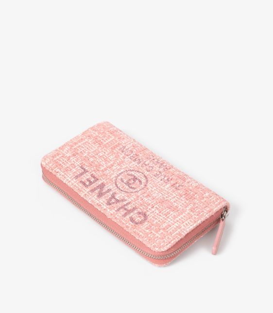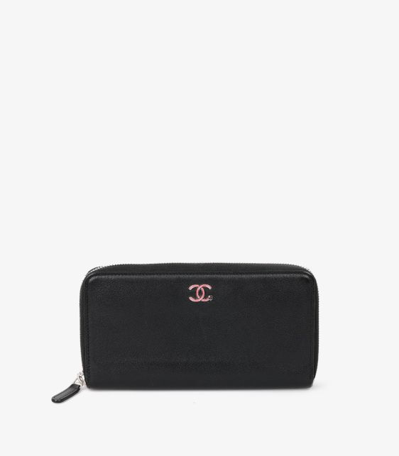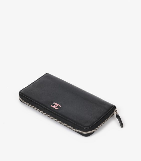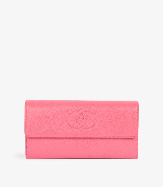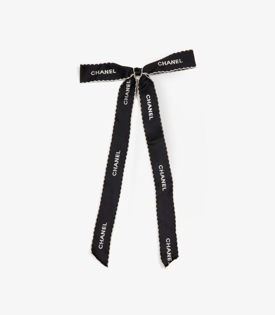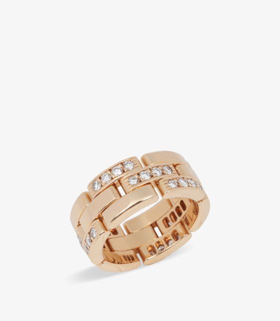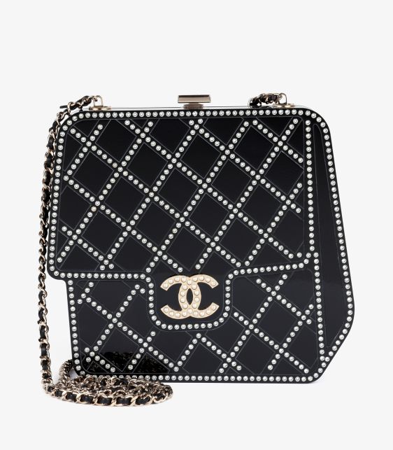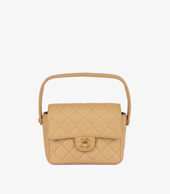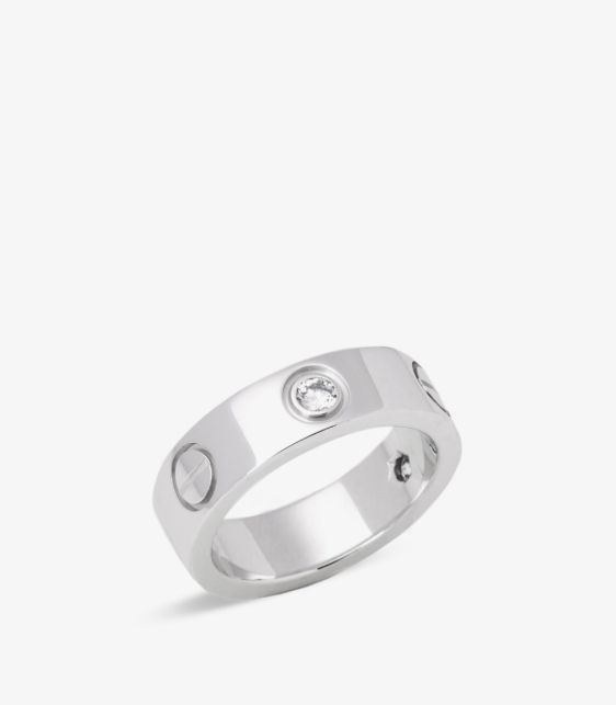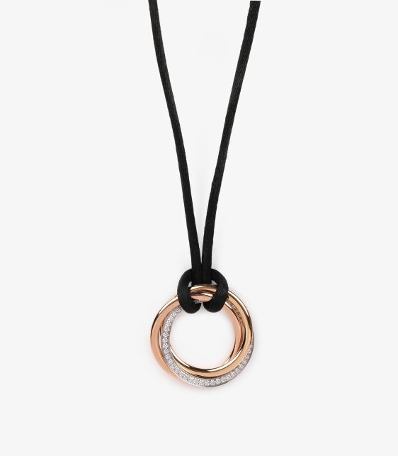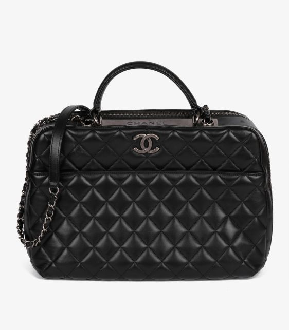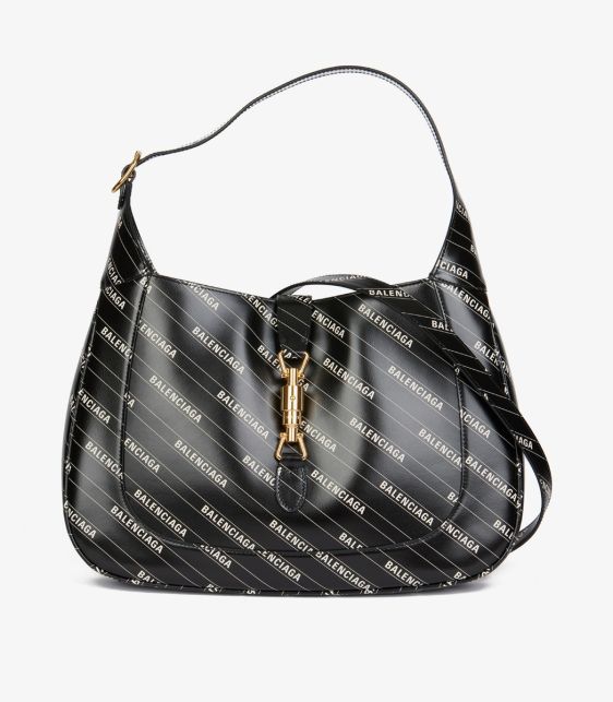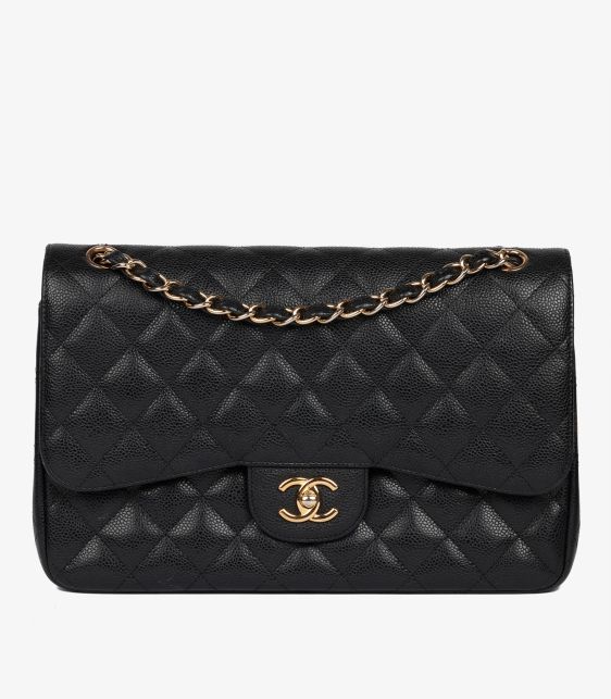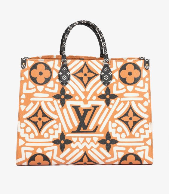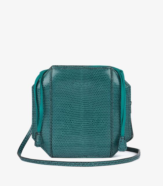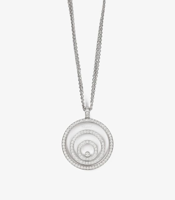




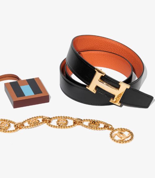
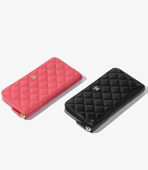
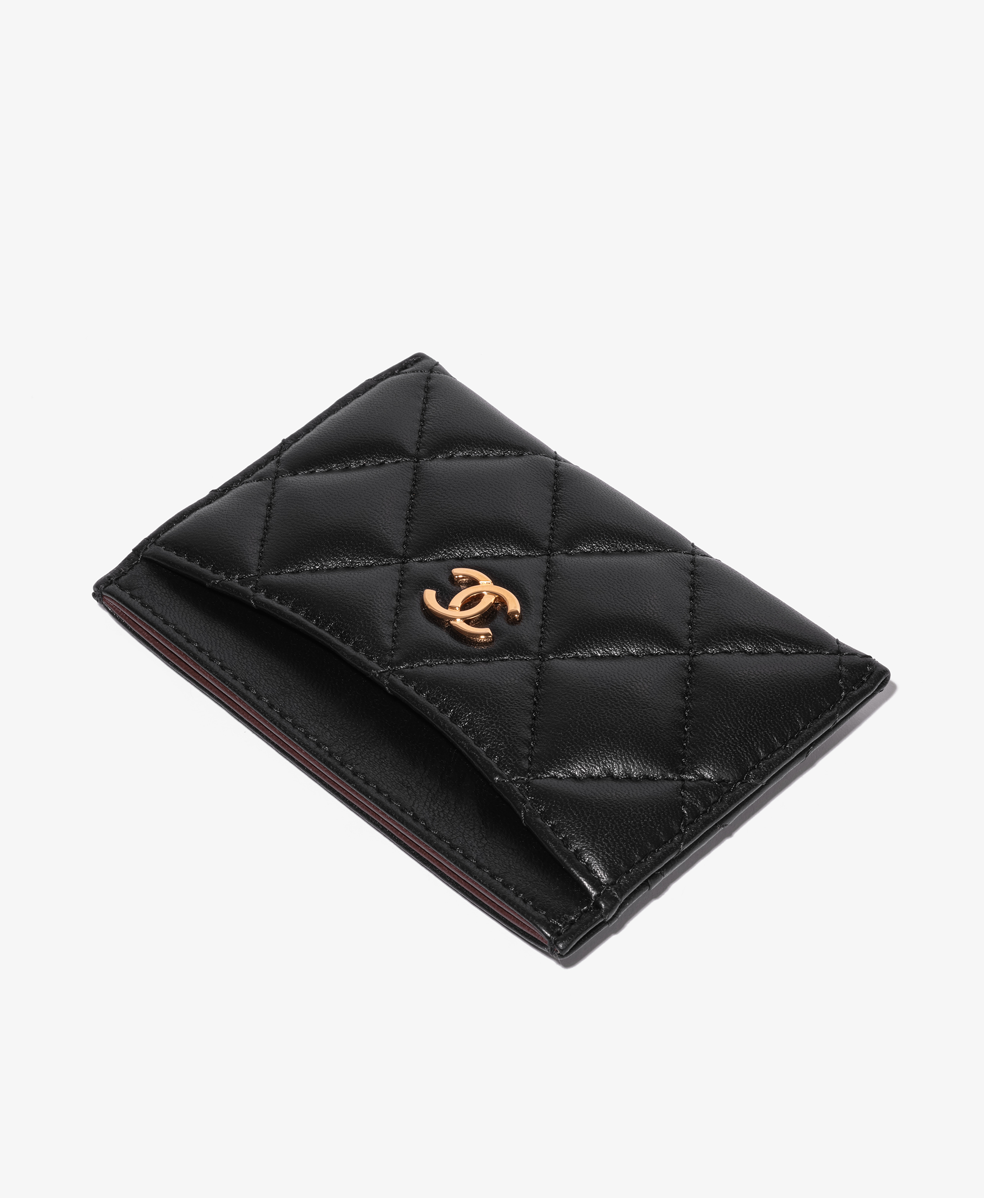
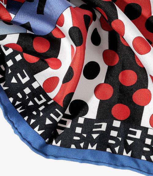
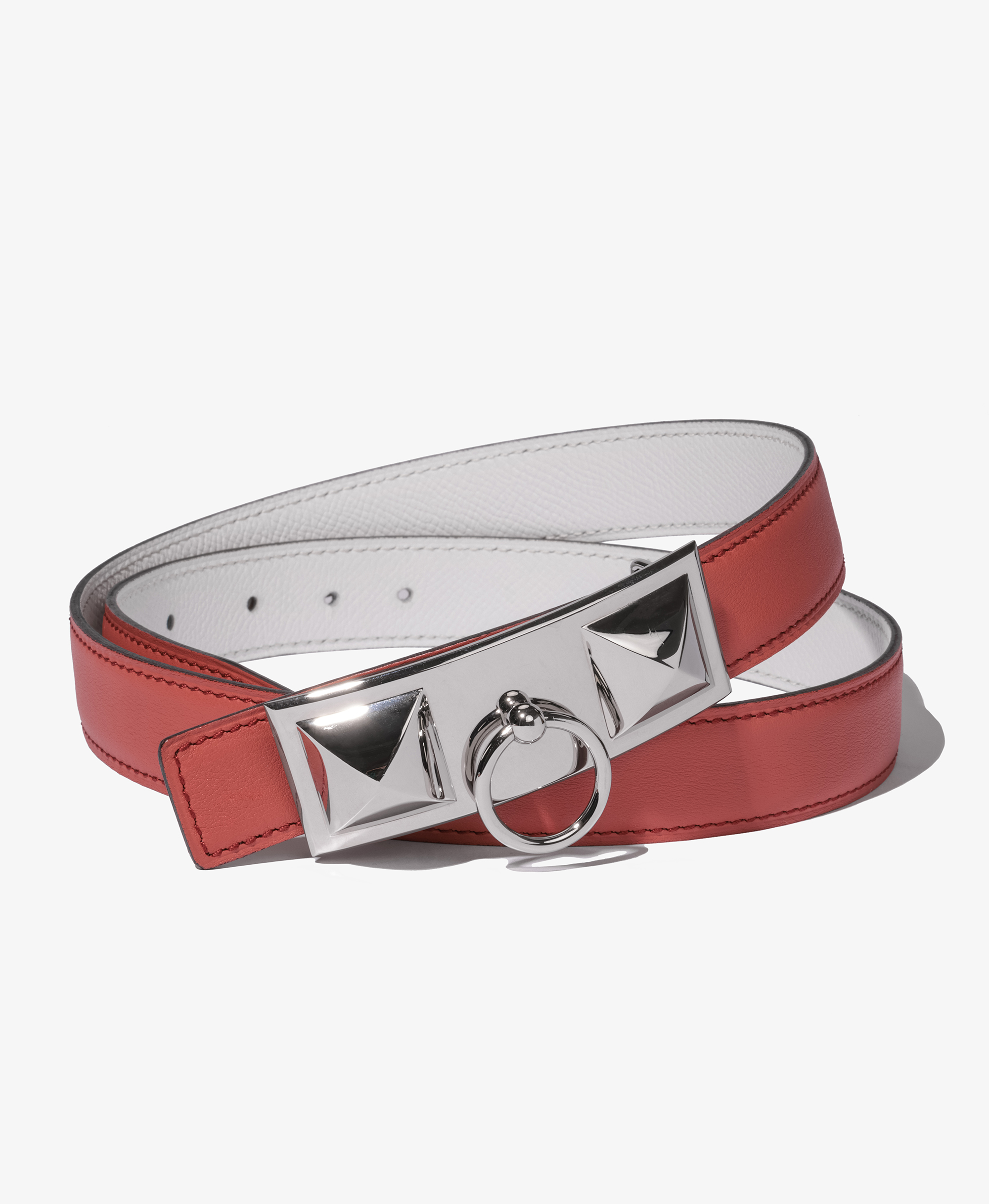
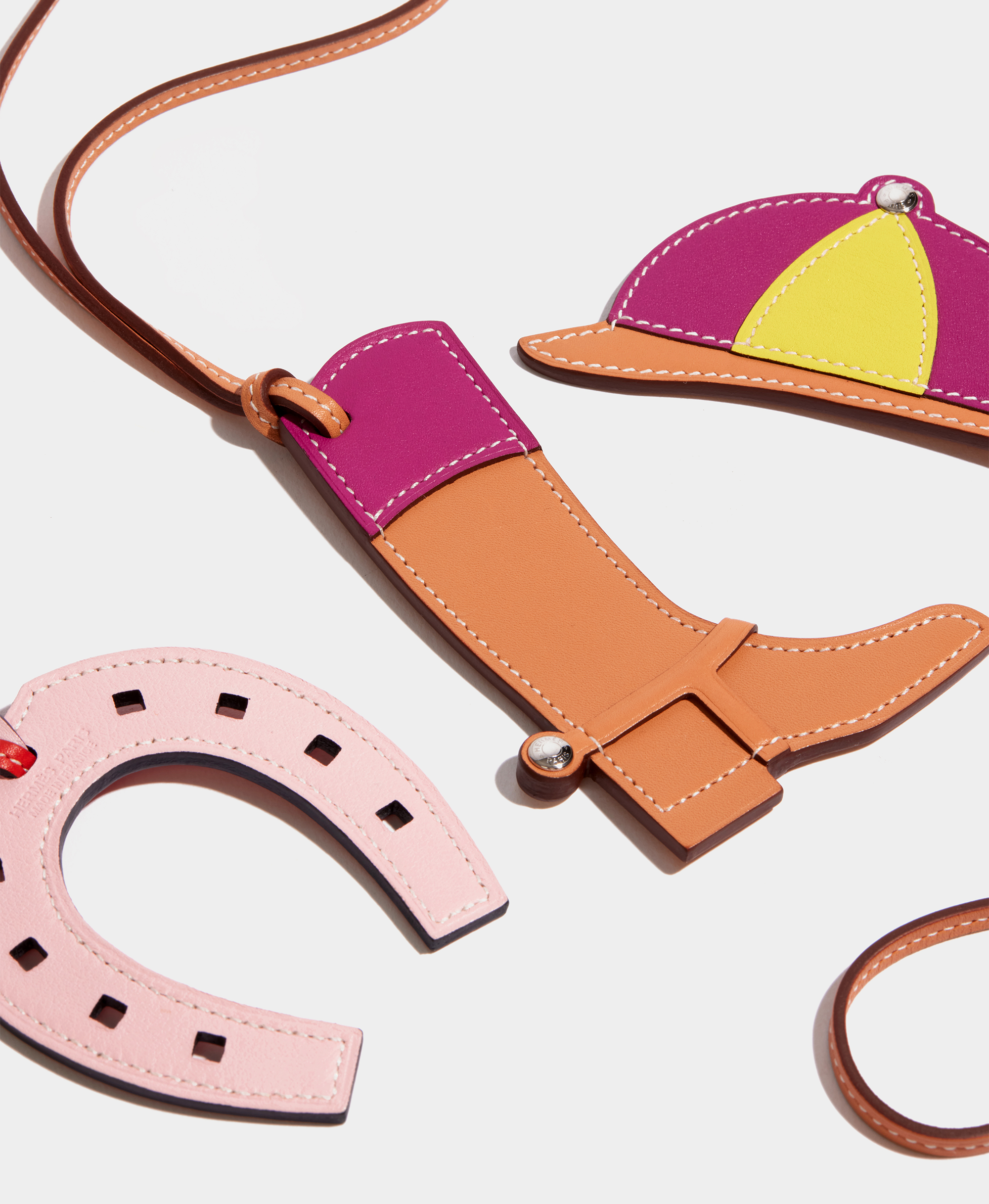
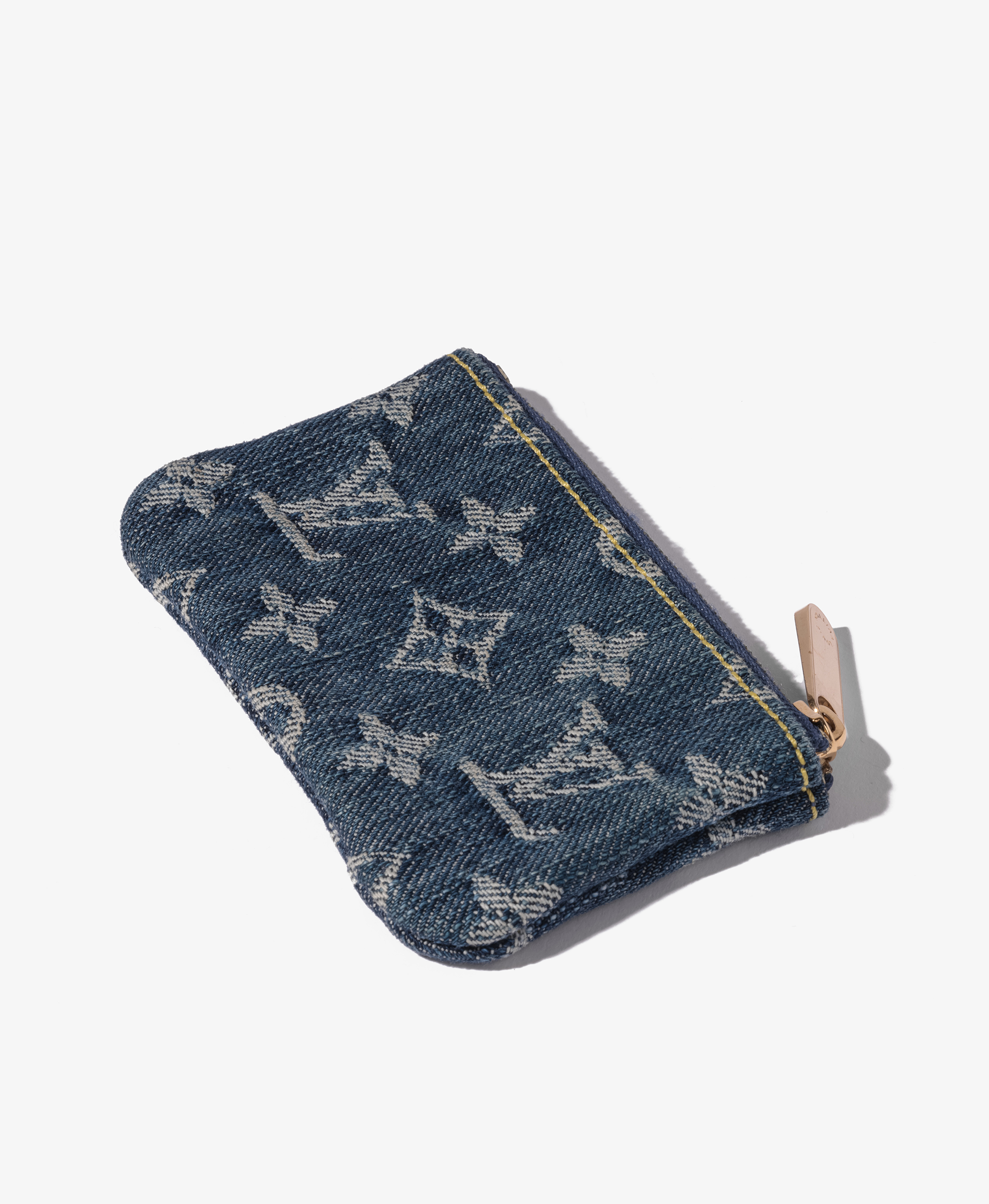
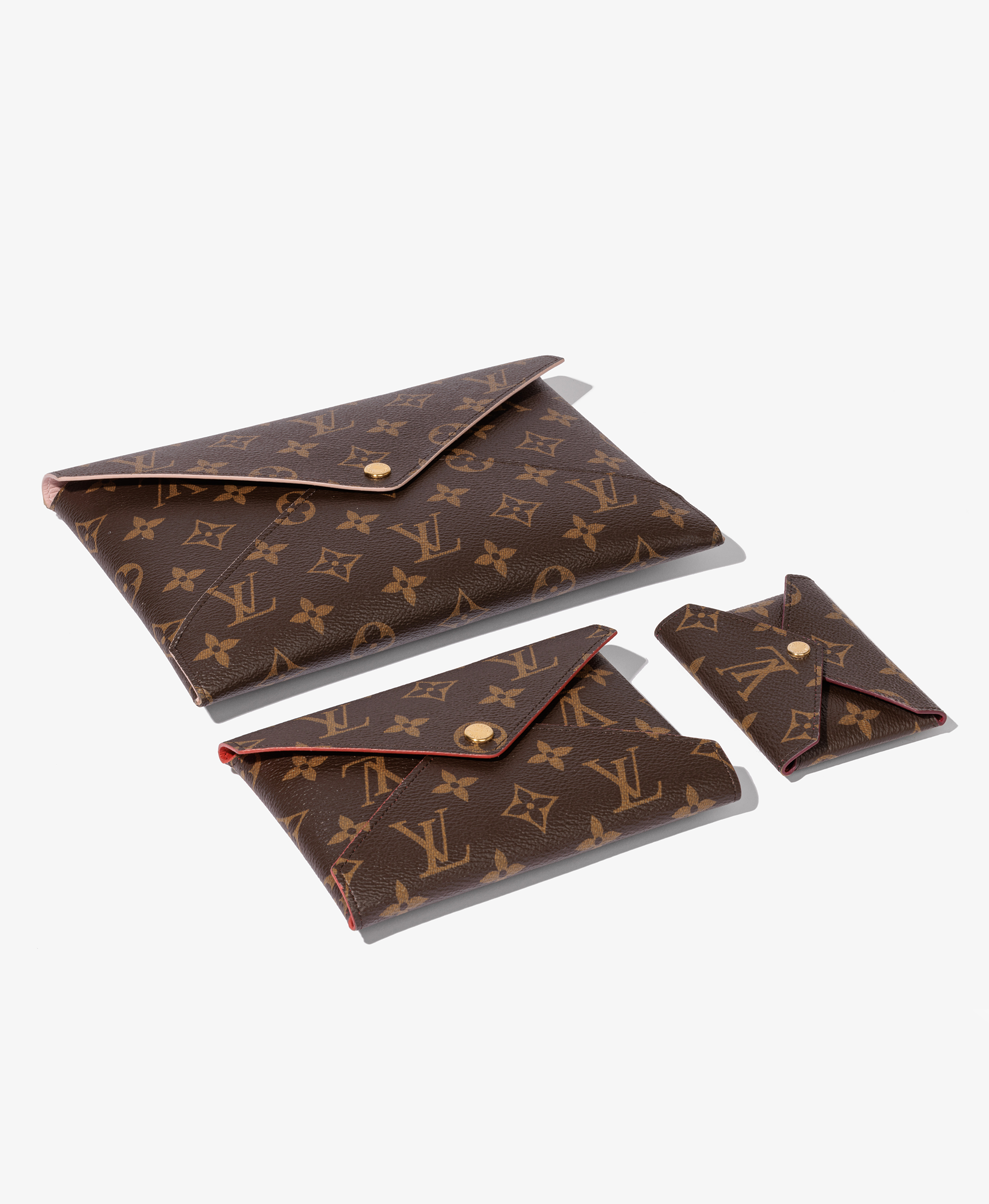
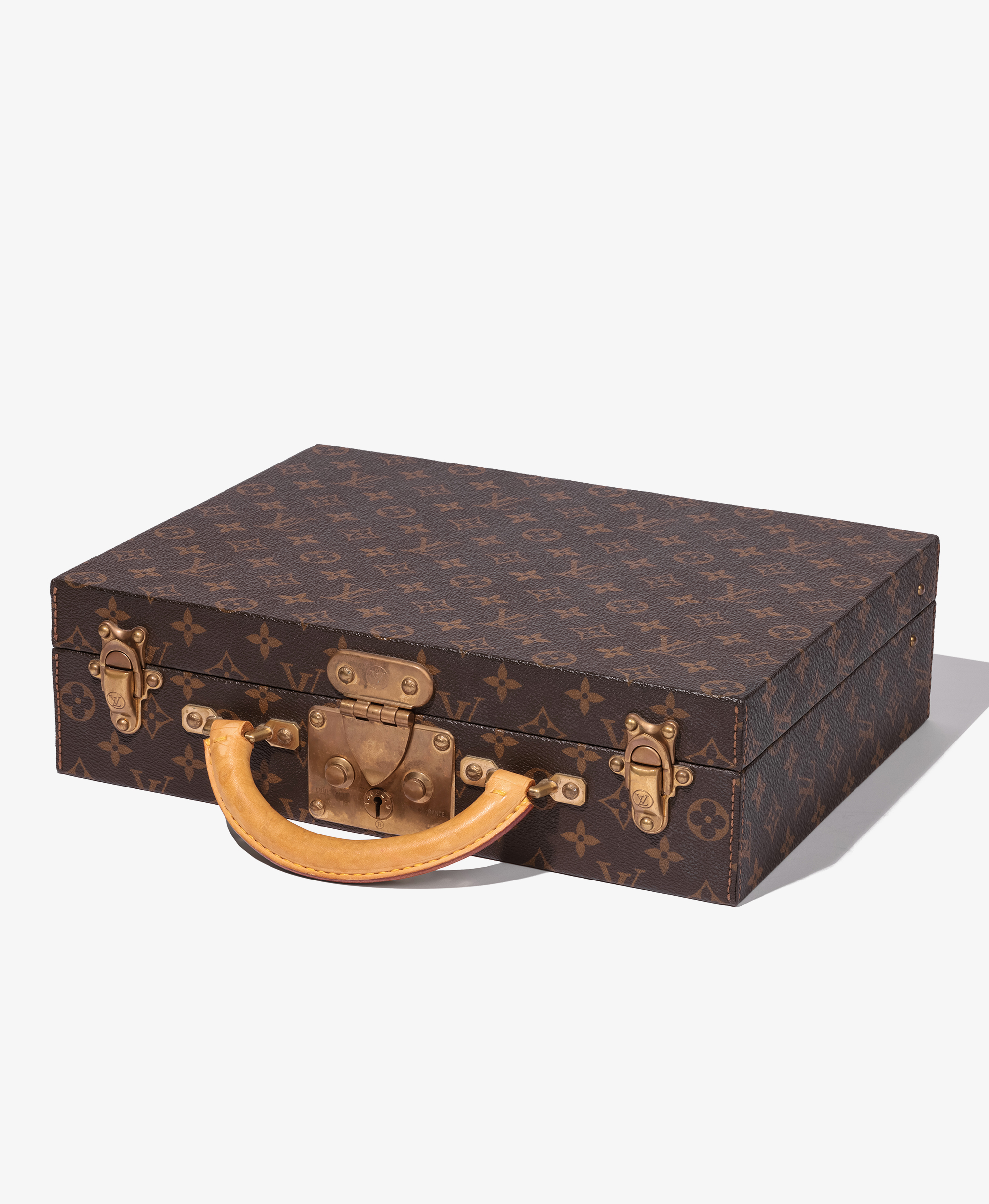
Discover our curated collection of designer pre-owned accessories that will ensure you are stylishly equipped for any occasion. Our edit of luxury belts, wallets, scarves and other accessories from brands including Chanel, Hermès, Louis Vuitton and Gucci offer the perfect way to complete your signature look.
no link: Discover the Xupes Promise think its too distracting and should be more of just touch points to remidn that we do retiurns and authenticity guarantee so think about that with the design of that one.
Sell or exchange button is a little harsh in colour, bit distracting.
Spacing on them are still too much above (see attached image on mobile. Needs to be the same between the bottom and the product image below than above and the text if that makkes sense.
Sell or exchnage sometimes shows up twice on one page.
Delivery only showed up once as did xupes promise. like xupes pomise this doesnt need a link. more visual, remember UK Next day and ecpress worldwide
5:22 PM
Updated the full snippet in the right-hand editor:
Promise: no link or button—just the icon, heading, Authenticity Guaranteed and 30-Day Returns.
Delivery: no link—UK Next Day, Express Worldwide, and Complimentary & Fully Insured.
Sell or Exchange: a softer pale-taupe button.
Spacing: now measures from visible product text above and the next product image below, targeting equal 24px gaps.
Duplicates: added cleanup for extra copies left when the grid refreshes.
Promise and delivery appeared once because they rotate across page numbers with press coverage. That rotation remains, keeping each listing to a maximum of two inserts.
Replace the entire previous snippet and reload. Syntax passes; the spacing and duplicate fix still need live verification.
5:23 PM
the gap mis now way too small and not even as the below.
Do we add one more for channel 4?
Also Xupes promise and delivery, should the textbox just be clickable to take you to those pages? no underline link text though.
Think I wont add instaghram here now. I like what it is forming.
5:26 PM
Yes to Channel 4—as another rotating option, not an extra insert on every page.
Updated the complete code in the right-hand editor:
Increased the spacing target to 48px above and below, measuring after the panel width is set.
Made the whole Promise and delivery panels clickable, with no visible link text or underline.
Added Second-Hand for 50 Grand to the secondary rotation: press → Promise → delivery → Channel 4.
Kept Instagram out.
Replace the previous snippet entirely. Syntax passes; the revised gaps still need checking on your mobile layout before I can call them resolved.
5:27 PM
okay, the gap is now near perfect, just needs the tiniest bit more.
Also SHF50G needs to be more as seem on channel 4, with their logo.
Then do you thinkwe have enough to just do a pattern that then just repeats
5:30 PM
Yes—we now have enough variety for a repeating pattern. I’ve updated the full code in the right-hand editor.
The sequence is:
Sell or Exchange → Xupes Promise → Press → Sell or Exchange → Delivery → Channel 4 → repeat
It runs every 18 products, continuing across page numbers and the 24/36/48/All options. Sell or Exchange appears more often, while each reassurance message repeats less frequently.
Also updated:
Gap increased slightly: 48px → 52px.
“As Seen on Channel 4”, using the same Channel 4 logo as your homepage.
Replace the previous snippet entirely. Syntax and sequence calculations pass; the revised layout still needs a live visual check.
5:30 PM
dont need two sell or exchanges also put press last
5:31 PM
Updated the full code in the right-hand editor:
Sell or Exchange → Xupes Promise → Delivery → Channel 4 → Press → repeat
One of each per cycle, still spaced every 18 products. Replace your previous snippet entirely.
5:31 PM
lastly, I dont want anything too dark, but as they are near same colour are they lost?
5:32 PM
They could blend together slightly. I’d keep the pale palette and create contrast through layout and tone:
Sell or Exchange: warm champagne, with the soft taupe button.
Xupes Promise: pale ivory, with two clearly separated reassurance points.
Delivery: a subtle stone-grey tint.
Channel 4: pale blush, with the logo providing contrast.
Press: near-white, letting the publication logos stand out.
Keep the same warm-brown text throughout. The backgrounds should feel subtly different—not like five coloured banners. Strong headings, generous spacing and distinct graphics will do more than darker colours.
5:32 PM
go for it
5:32 PM
Updated the complete code in the right-hand editor with champagne, ivory, stone, blush and near-white panels.
The warm-brown text, spacing and repeating sequence remain unchanged. Replace the previous snippet entirely. Syntax checked; colours still need a live visual check.
5:32 PM
g-p-697dfa757c5481918b3581a1c8c2e138
xupes-plp-footer-COPY-ALL.txt
Please note, we have no association or affiliation with the brands that we mention or sell. Every single item in our collection has been independently authenticated by our team of in-house specialists.